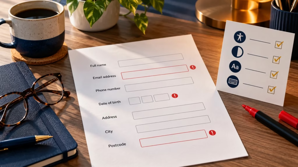

A form can look simple while still creating unnecessary barriers. A missing label, a vague instruction or an error message that only changes colour can stop someone from completing a purchase, requesting support or subscribing to a service.
A useful accessible form makes each field’s purpose clear, explains unusual requirements before submission, identifies errors in text and helps the visitor correct them without losing valid work.
This guide focuses on practical content and interaction decisions. It complements the website accessibility audit checklist and the wider principles in Inclusive Web Design.
Start with a clear form purpose
Ask for only the information required to complete the task. Every additional field increases effort, creates another opportunity for error and may introduce a privacy obligation. Group related questions, put them in a logical order and explain what will happen after submission.
- Use a short heading that names the task rather than the software or department.
- Explain why sensitive or unexpected information is needed.
- Mark required and optional fields consistently; do not rely on colour alone.
- Keep the primary action specific, such as Send enquiry or Create account.
Give every control a visible label
Placeholder text is not a dependable replacement for a label. It disappears when someone types, may have weak contrast and does not always provide a stable accessible name. Use a visible <label> associated with the control’s unique id.
<label for="email">Email address</label>
<input id="email" name="email" type="email" autocomplete="email">
The label should describe the information being requested. Avoid labels such as Details or Value when a more precise phrase is available. If the interface contains links, review them with the Link-Text Accessibility Checker so they remain meaningful out of context.
Put instructions where people need them
Provide unusual format, password or eligibility requirements before the visitor submits the form. Place concise help next to the relevant field and connect it programmatically with aria-describedby when appropriate.
<label for="account-password">Password</label>
<p id="password-help">Use at least 12 characters.</p>
<input id="account-password" type="password" aria-describedby="password-help">
Do not hide essential instructions in a tooltip that requires precise pointer movement. If an example is enough, keep it short and distinguish it from the required value.
Write error messages that help someone recover
An error message should identify the affected field, state what went wrong and, where possible, explain how to correct it. Avoid blaming language and messages such as Invalid input that leave the visitor guessing.
Weak message | More useful message | Why it helps |
|---|---|---|
This field is invalid | Email address: enter an address in the format name@example.com | Names the field and gives a correction |
Required | Postcode: enter your postcode | Makes sense when announced away from the field |
Password error | Password: use at least 12 characters | States the requirement without exposing the password |
The Accessible Form Error Message Builder provides an editable starting point for inline messages and summary links. It does not replace testing or secure validation.
Use an error summary for submitted forms
When submission produces one or more errors, place a concise summary near the start of the form. Give it an informative heading, link each item to the relevant field and move focus to the summary when that helps keyboard and screen-reader users discover the result. Keep the inline message beside each field as well.
<div role="alert" class="error-summary">
  <h2>There is a problem</h2>
  <a href="#email">Email address: enter a valid address</a>
</div>
Dynamic validation needs care. Announcing every keystroke can be distracting, while delaying all feedback until the end can create extra work. Choose timing that suits the task, announce concise changes, and do not unexpectedly move focus while someone is typing.
Preserve valid input and explain the next step
If submission fails, keep information that remains valid. Clearing the entire form forces people to repeat work and can be particularly costly for visitors using speech input, switch controls or screen magnification. Never echo passwords or payment details back into insecure contexts.
Test the complete experience
- Complete the form using only a keyboard and confirm focus is always visible.
- Submit it empty, with one error and with several errors.
- Check that labels, help and error text are announced with the relevant control.
- Zoom to 200% and 400% and test a narrow mobile viewport without horizontal scrolling.
- Confirm colour is not the only way an error or required field is communicated.
- Verify that valid values remain after a failed submission.
- Test server-side validation because client-side checks can be bypassed.
- Ask people with disabilities to test important or high-volume journeys where practical.
Final Thoughts
Accessible forms are not achieved by adding one ARIA attribute at the end. Start with fewer questions, visible labels and plain instructions, then build a recovery path that helps people find and correct mistakes. Test the real journey—including failure states—before treating the form as complete.
Frequently asked questions
Can placeholder text replace a form label?
No. Placeholder text disappears as someone types and does not provide the same persistent context as a visible, programmatically associated label.
Should every form error use role=alert?
No. Live announcements should be concise and deliberate. An error summary after submission may use an alert pattern, but repeatedly announcing validation while someone types can create noise.
Does client-side validation make a form secure?
No. Client-side validation can improve usability, but the server must still validate and safely process every submission.