Modern web design relies heavily on flexible layouts that adapt to different screen sizes and devices. Two of the most powerful layout tools available to front-end developers today are CSS Grid and Flexbox.
Both technologies were introduced to solve layout challenges that older techniques like floats, tables, and positioning hacks struggled with. While they can sometimes achieve similar visual results, they are designed for different layout purposes.
Understanding when to use each system helps developers create cleaner code, more responsive layouts, and easier-to-maintain websites. Layout decisions also play an important role in performance metrics such as Core Web Vitals, which measure real-world user experience on websites.
In this guide, we’ll explore how CSS Grid and Flexbox work, their key differences, and when to use each layout method in modern web development.
What Is Flexbox?
Flexbox, or the Flexible Box Layout, is designed for one-dimensional layouts. It allows developers to align and distribute items along a single axis.
This axis can be:
- Horizontal (row)
- Vertical (column)
Flexbox makes it easy to control spacing, alignment, and ordering of elements inside a container.
Example Flexbox Layout
.container {
  display: flex;
  justify-content: space-between;
  align-items: center;
}
This code creates a flexible container where items are spaced evenly and aligned vertically.
When Flexbox Is Most Useful
Flexbox works best when arranging items in a single row or column, such as:
- navigation menus
- buttons or toolbars
- form controls
- card layouts
- alignment within components
Because Flexbox distributes space dynamically, it is extremely useful for UI components. Well-structured layouts also contribute to better usability and accessibility, helping create more inclusive digital experiences for users.

What Is CSS Grid?
CSS Grid is designed for two-dimensional layouts, meaning it controls both rows and columns simultaneously.
Grid allows developers to build complex layouts with precise placement of elements across a structured grid system. These layout patterns are often incorporated into larger design systems that help maintain consistency across websites and digital products.
Example CSS Grid Layout
.container {
  display: grid;
  grid-template-columns: repeat(3, 1fr);
  gap: 20px;
}
This creates a three-column layout where each column takes equal space.
Grid is ideal for page-level layouts, where elements need to align across rows and columns.
When CSS Grid Is Most Useful
CSS Grid works well for:
- page layouts
- dashboards
- image galleries
- magazine-style designs
- structured content sections
The Key Difference: One Dimension vs Two
The biggest difference between Flexbox and Grid is how they handle layout dimensions.
- Flexbox is for one-dimensional layouts
- CSS Grid is for two-dimensional layouts
Think of it like this:
- Flexbox = content flows in one direction
- Grid = content is placed in a structured layout system
CSS Grid vs Flexbox Comparison Table
Feature | Flexbox | CSS Grid |
|---|---|---|
Layout type | One-dimensional | Two-dimensional |
Best for | Components | Full page layouts |
Direction | Row or column | Rows and columns |
Control | Content-based alignment | Structure-based placement |
When to Use Flexbox
Flexbox is ideal when elements need to be arranged in a single direction, either horizontally or vertically. It works particularly well for aligning interface components and distributing space between elements inside a container.
Because Flexbox focuses on one-dimensional layouts, it is commonly used for small interface sections rather than full page layouts.
Common Use Cases for Flexbox
Navigation menus
Flexbox makes it easy to align navigation items in a horizontal row and distribute space between them. This is particularly useful for responsive menus where items need to adapt to different screen sizes.
Button groups and toolbars
Buttons can automatically space themselves evenly within a container. Flexbox also makes it easy to control alignment, spacing, and wrapping when screen sizes change.
Form rows
Flexbox works well for aligning form labels and input fields in clean horizontal layouts, helping create more consistent and responsive form designs.
Card content alignment
When working with card layouts, Flexbox can keep elements aligned even when content length varies. This ensures buttons, icons, or actions stay in consistent positions.
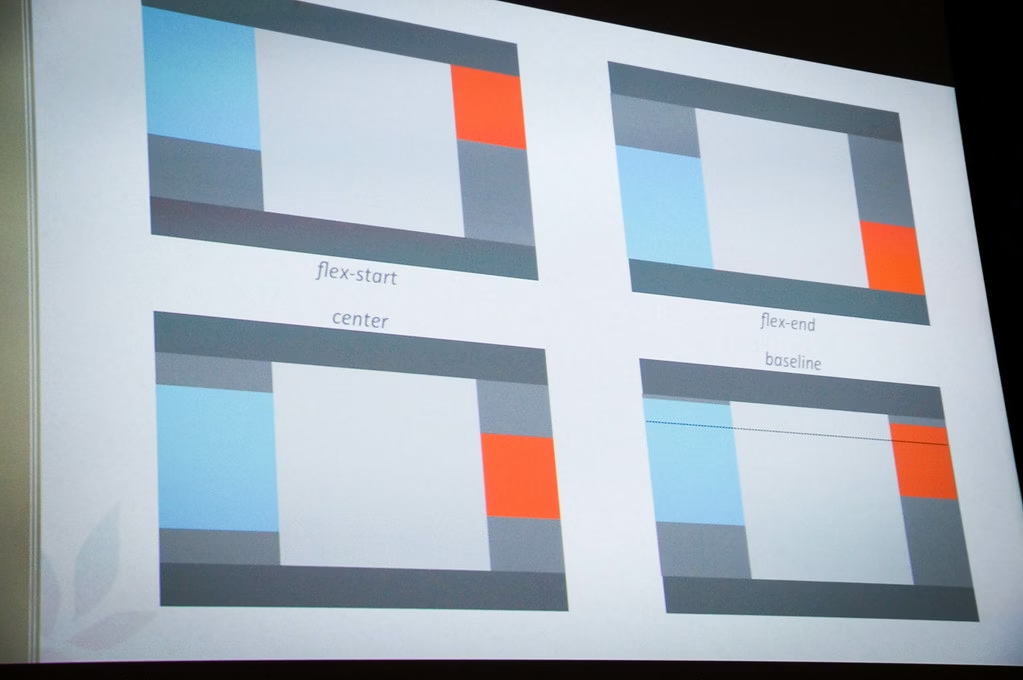
Centering elements
One of Flexbox’s most useful features is simple vertical and horizontal centering. With just a few lines of CSS, elements can be perfectly centred within a container.
Example of Centring with Flexbox
.container {
  display: flex;
  justify-content: center;
  align-items: center;
}
This is one of the simplest ways to centre content both horizontally and vertically.
When to Use CSS Grid
CSS Grid excels when building layouts that require control over both rows and columns. Unlike Flexbox, which focuses on one direction, Grid allows developers to structure entire sections of a page with precise placement of elements.
Because of this, CSS Grid is commonly used for larger layout structures, such as full-page designs or complex content sections.
Common Use Cases for CSS Grid
Full-page layouts
CSS Grid is ideal for defining the main structure of a webpage. Developers can easily position major sections such as the header, sidebar, main content area, and footer.
Blog page structures
Many blogs use grid layouts to organise content areas, including article listings, sidebars, and featured sections.
Dashboard interfaces
Dashboards often contain multiple panels, charts, and widgets. Grid allows these elements to be arranged in a structured layout that adapts well to different screen sizes.
Image galleries
CSS Grid is particularly useful for galleries because it allows images to be arranged consistently across rows and columns.
Section-based landing pages
Modern landing pages often contain structured sections such as feature grids, pricing tables, and product highlights. Grid provides a flexible way to organise these sections while maintaining consistent spacing.
Example of a Grid-Based Page Layout
CSS Grid can be used to define the overall structure of a webpage.
For example, a simple page layout might include:
- header
- sidebar
- main content
- footer
Example CSS:
.page-layout {
  display: grid;
  grid-template-columns: 250px 1fr;
  grid-template-rows: auto 1fr auto;
  gap: 20px;
}
This creates a layout where the sidebar and main content sit side by side, while the header and footer span the full width of the page.
Can You Use CSS Grid and Flexbox Together?
Yes and in many cases this is the most effective approach.
Rather than choosing one layout system over the other, developers often combine them to take advantage of their strengths.
A typical layout might use:
- CSS Grid for the overall page structure
- Flexbox for aligning items inside components
For example, a page might use Grid to define the main layout, while Flexbox is used within navigation bars, cards, or button groups.
Example of Using Both Together
.page {
  display: grid;
  grid-template-columns: 250px 1fr;
}

.nav {
  display: flex;
  justify-content: space-between;
}
In this example, CSS Grid defines the main page layout, while Flexbox handles alignment within the navigation component. This combination keeps layouts flexible and easier to maintain.
Browser Support
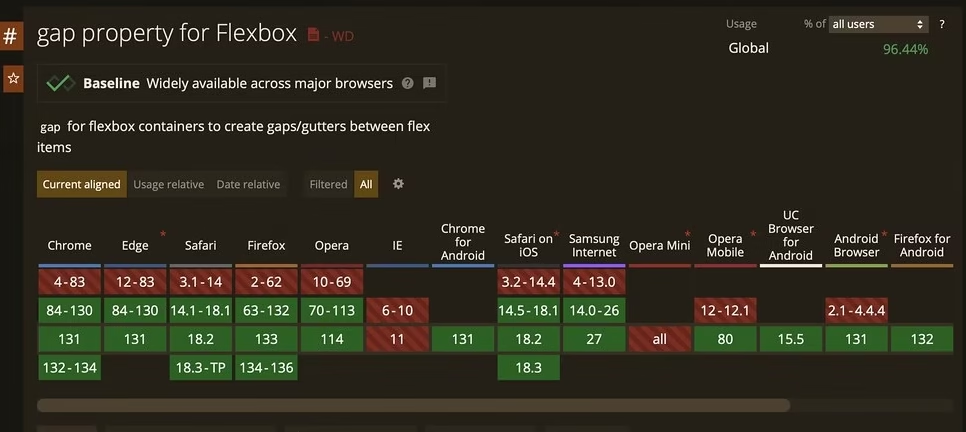
Both CSS Grid and Flexbox are well supported across modern browsers, including:
- Chrome
- Firefox
- Safari
- Edge
Older browsers like Internet Explorer have limited support for CSS Grid, but most modern projects no longer target those environments.
Common Mistakes Developers Make
When learning CSS Grid and Flexbox, developers often run into a few common issues. Understanding these early can help you choose the right layout tool and avoid unnecessary complexity in your code.
Using Flexbox for Full Page Layouts
Flexbox works best for one-dimensional layouts, but some developers attempt to build entire page structures using it. When layouts require both rows and columns, this can quickly become difficult to manage.
For example, a page layout containing a header, sidebar, main content area, and footer is much easier to organise using CSS Grid, which allows elements to be positioned across both rows and columns.
Over complicating Simple Layouts with CSS Grid
CSS Grid is extremely powerful, but sometimes developers reach for it when a simpler Flexbox layout would work perfectly.
If you only need to align a row of items, space buttons evenly, or centre content inside a container, Flexbox usually provides a cleaner and more efficient solution.
Treating CSS Grid and Flexbox as Competitors
Some developers assume they must choose either Grid or Flexbox for their layouts. In reality, the two layout systems are designed to complement each other.
CSS Grid works well for overall page structure, while Flexbox is excellent for aligning items inside components such as navigation menus, cards, and button groups.
Practical Example
Imagine building a blog layout.
You might use CSS Grid to define the main page structure, such as:
- header
- sidebar
- main content area
- footer
Inside these sections, Flexbox can be used to align smaller interface elements, including:
- navigation menus
- article cards
- buttons and toolbars
This layered approach allows developers to create layouts that are both structured and flexible.
Final Thoughts
CSS Grid and Flexbox are two of the most useful layout systems in modern front-end development. While they can sometimes appear similar, they are designed for different jobs.
Flexbox is ideal for one-dimensional alignment, while CSS Grid is better for two-dimensional structure.
In many real projects, the strongest approach is not choosing one over the other, but knowing when to use each one. Well-structured layouts also contribute to better website performance and search visibility when combined with modern optimisation techniques.